
Revolution Roller Rink
Branding
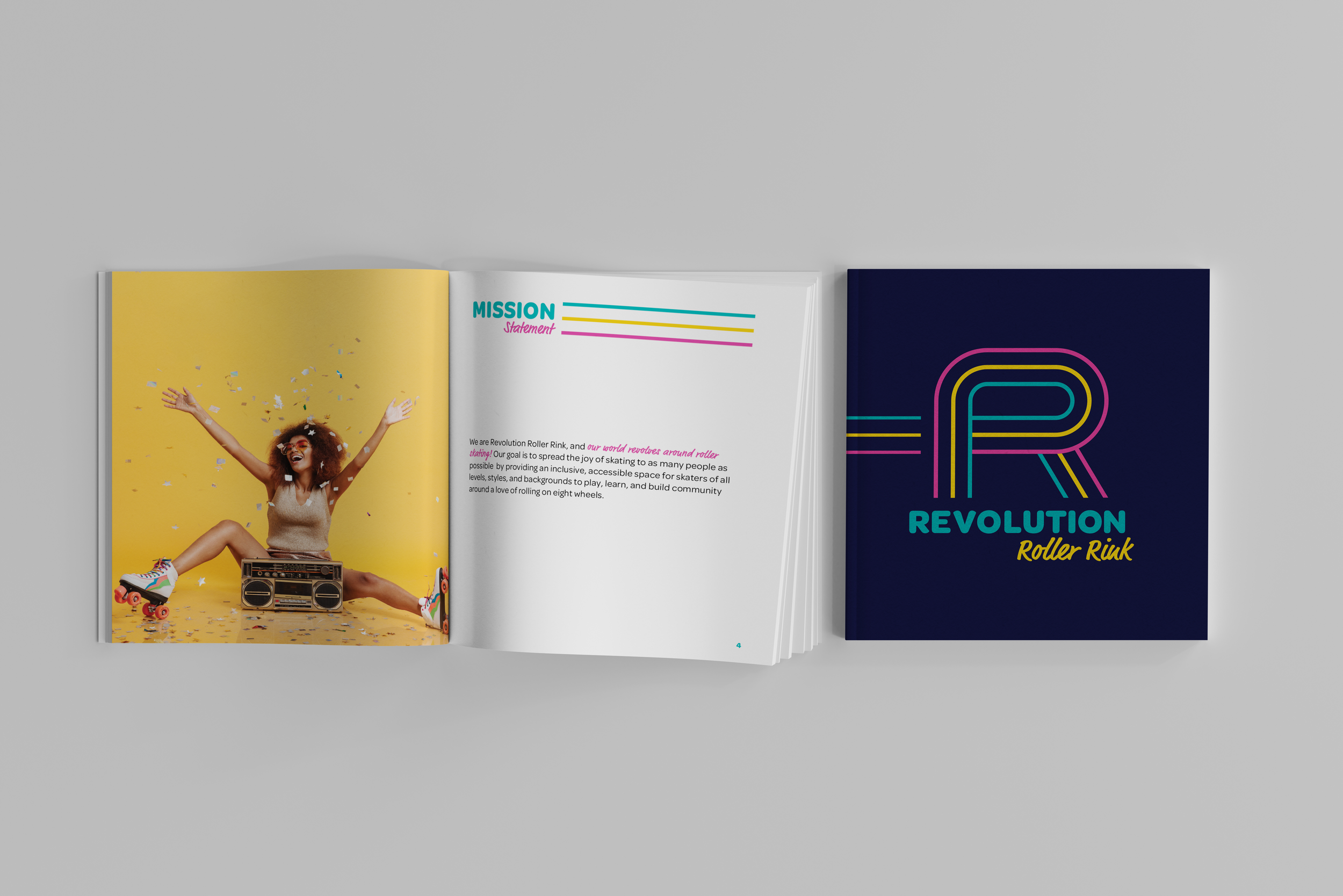
At Revolution Roller Rink, the world revolves around roller skating. Revolution’s goal is to spread the joy of skating to as many people as possible by providing an inclusive, accessible space for skaters of all levels, styles, and backgrounds to play, learn, and build community around a love of rolling on eight wheels.
Challenge: To develop a full branding package for Revolution Roller Rink, including naming, logo, and additional brand elements as needed, and to design a booklet detailing the brand guidelines.
Inspiration & Ideation
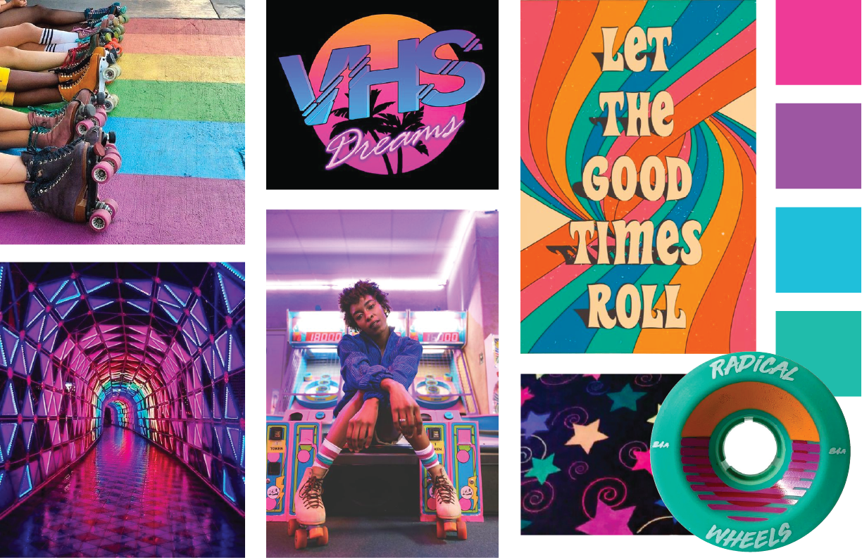
Moodboard
Roller skating has had a huge resurgence in popularity in recent years, but many people still associate roller rinks with another time – the heyday of roller disco in the 70’s and 80’s, or attending roller skating birthday parties as a child. So when looking for inspiration for Revolution’s branding, it just made sense to go somewhat retro, paired with vibrant, energetic colors, and references to the brand’s core values like community and inclusivity.
Sketches
In my sketches, I explored ways to express movement, rotation, connectivity and growth, thinking about how these shapes could inform the logo, patterns, a set of icons, etc.


Digital Drafts
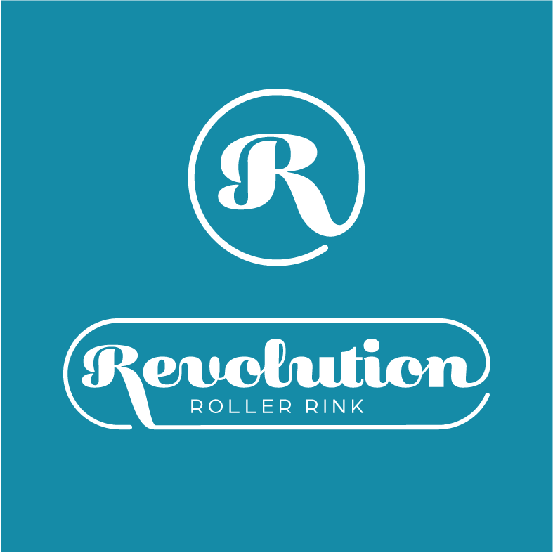
After sketching some initial ideas, I began working on three potential logo directions, each referencing movement in some way, inspired by the rotation of wheels or the shape of the rink itself.

Round One
Round 2
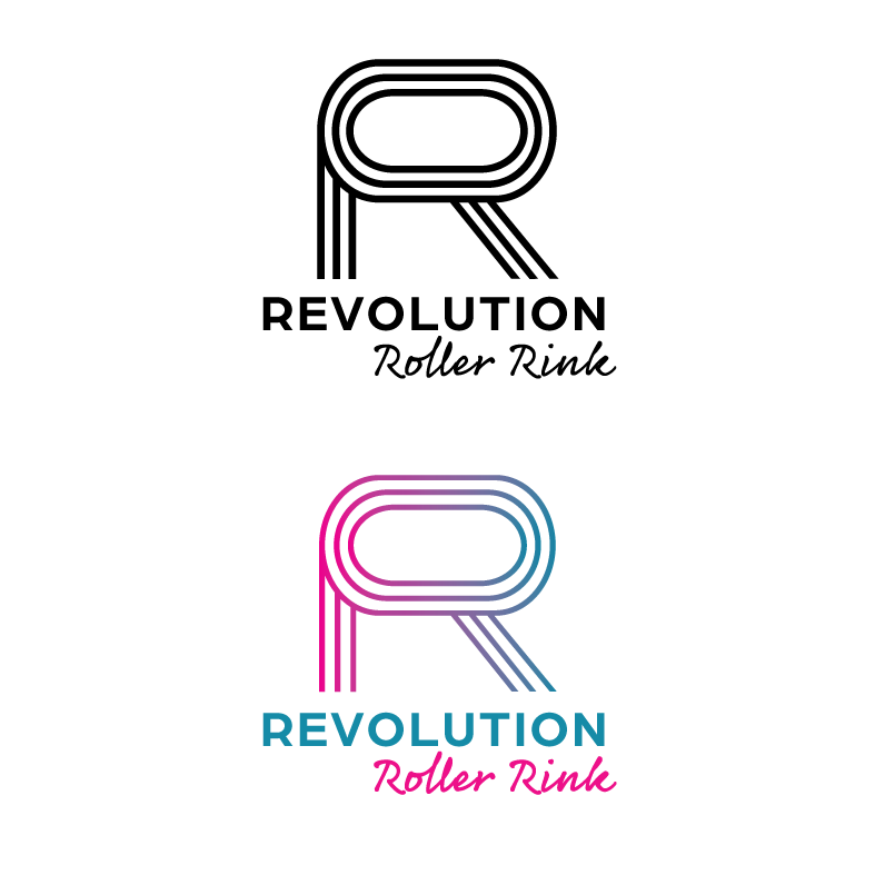
After receiving feedback, I moved forward with the custom letter R option, with its wide counter space representing the elliptical shape of a roller rink, and refined the shape to make the letterform more legible. The finishing touches for the final logo would include type and color changes to better suit the fun and friendly personality of the brand.

Final Design
Logo Overview
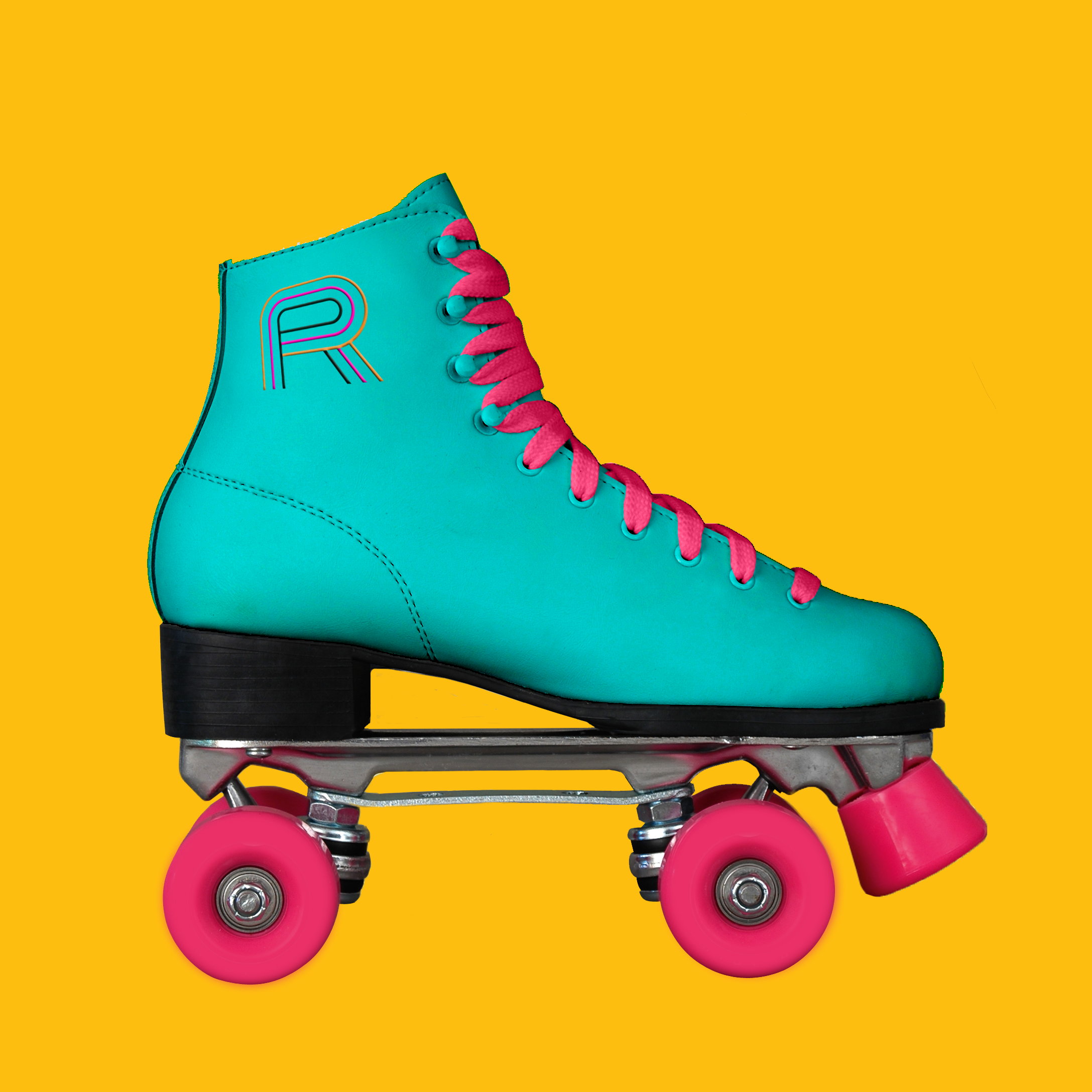
The logo is an essential part of the Revolution Roller Rink brand identity, representing the company’s values, as well as a passion for roller skating. The custom letter logo mark is made up of three lines inspired by movement, community, and the three R's in the name, and features a wide counter space that mimics the elliptical shape of a traditional roller rink. The logo fonts were selected for their playful characteristics, while the combination of typefaces references the 1970's and 80's when roller skating was a major pop culture phenomenon.
Logo Variations

Type & Color

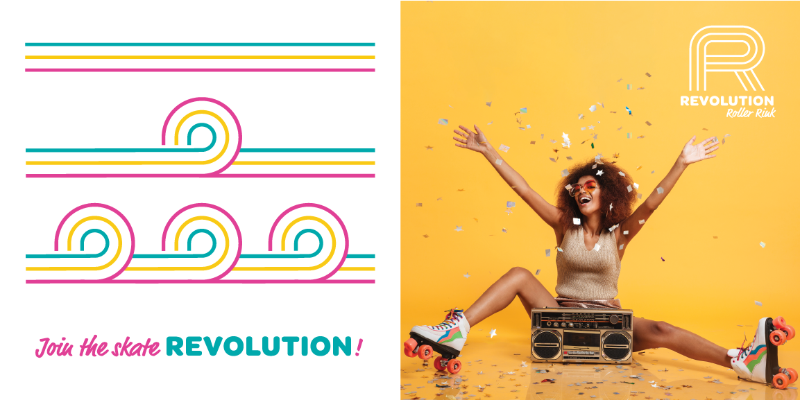
Pattern, Tagline & Photography


Reflection
I really enjoyed working on this project and learning more about the branding process through developing the brand book. The biggest challenge was figuring out how to anticipate future branding needs and considering a variety of use case scenarios for the elements I created. But I quickly became excited about the possibilities, and let myself enjoy the exploration, discovery, and problem solving. Overall, I am happy with the end result. I feel like I created something fun and vibrant that the rollerskating community will resonate with. Moving forward, I would love to expand the brand further to include illustrations and icons.