
Dragon’s Lair
Logo Design
Dragon’s Lair is a games and comics franchise founded in Austin, Texas in 1986. The original location is Austin’s hub for tabletop gaming, comics, fantasy, and related fandoms. They strive to provide a safe, welcoming, and inclusive space for people to shop, play, and participate in store events.
Challenge: To redesign a logo for an existing brand.
Why Redesign the Dragon’s Lair logo? The current logo has been around for 35 years and is in need of a refresh. It includes a detailed illustration of a dragon along with layered elements which can make resizing and legibility an issue. My goal was to create a more streamlined and versatile mark to meet all of the store’s branding needs while also speaking to its positive and inclusive atmosphere.
Current Logo

Inspiration & Ideation
Moodboard
I was inspired by the variety of fun products on offer at Dragons Lair, from games, to comics, to collectibles, and more. And, of course, no Dragon’s Lair moodboard would be complete without dragons. I looked to examples of classic medieval and high fantasy dragons as well as some cuter, friendlier versions to compliment the store’s commitment to customer service and inclusivity.

Sketches


Digital Drafts
After generating ideas through sketching, I created a round of digital drafts and selected three of the top options to present – a dragon game piece, a sleeping dragon with a book, representing a comic book or gaming rule book, and a typographic form inspired by a game box or treasure chest. After receiving feedback, I moved forward with the sleeping dragon option, which best resonated with the store’s values. The next steps included making adjustments to the typography and exploring a variety of color options before finalizing the design.


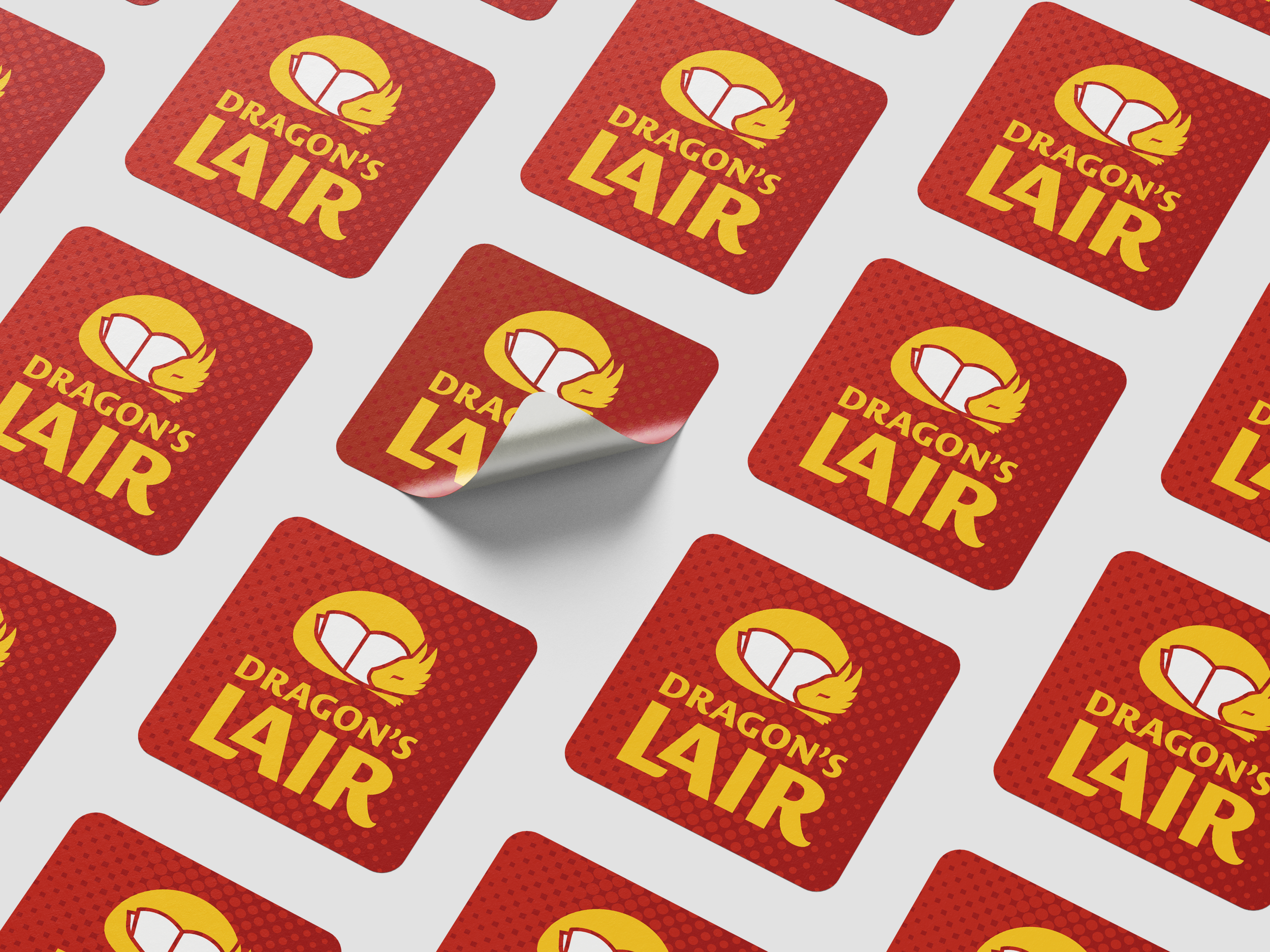
Final Design


Reflection
The main creative challenge for this project was considering what might appeal to the store’s wide demographic. There is no one aesthetic to represent all of the fandoms that Dragon’s Lair serves. Instead, I focused on creating a simple image that felt friendly and inviting to all, with a historical reference to the original logo through the use of a dragon. The resulting mark is clean, legible, and easily reproducible at various sizes, while also communicating the fun, friendly, and welcoming personality of the brand. I think it could make a great addition to a brand refresh for the store.