

Bruja Cold Brew
Packaging Design | Illustration
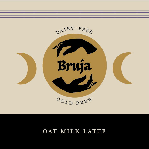
Bruja Cold Brew is a small coffee company with a lot of charm. Their belief that drinking coffee can be a magical experience is at the center of their commitment to provide quality vegan coffee drinks, using fair trade, locally roasted coffee beans, craft brewed to perfection. These bewitching brews will leave you spellbound!
Challenge: To design unique, eye-catching beverage packaging with the ability to stand out amongst the competition.
Inspiration & Ideation
Moodboard
The concept of coffee as a magical experience led me towards a witchy aesthetic. I wanted something dark but exuberant to compliment the nature of coffee. I was also inspired by the illustrative and narrative cans that can often be found in the beer aisles of stores like Whole Foods, and, more recently, in some sparkling water brands.

Sketches
When sketching the initial ideas, the name of the brand was not yet decided. So I explored different options for naming, logotype, and illustration. The illustration exploration included arcane inspired symbols, patterns, and the concept of individual characters to represent specific flavors.The next step was to digitize some of the best sketches.

Digital Drafts
Round one
From my sketches, I created four digital drafts, exploring various type, color and image options to communicate the magical theme of the brand. Based on this exploration, I decided to move forward with a combination of elements from options 1 and 4, with a strong focus on the character illustration, which provides an engaging narrative element for customers to connect with and helps to distinguish the brand from the competition.


Round Two
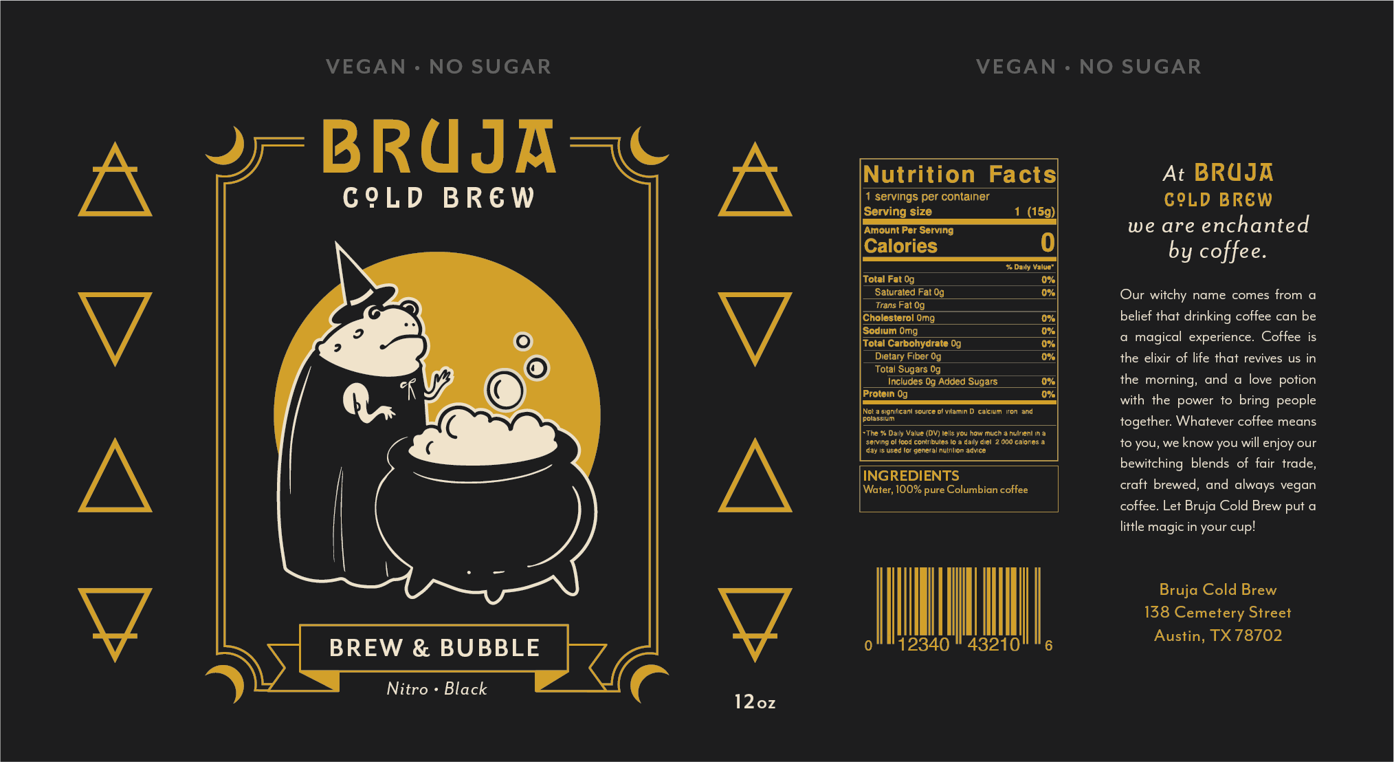
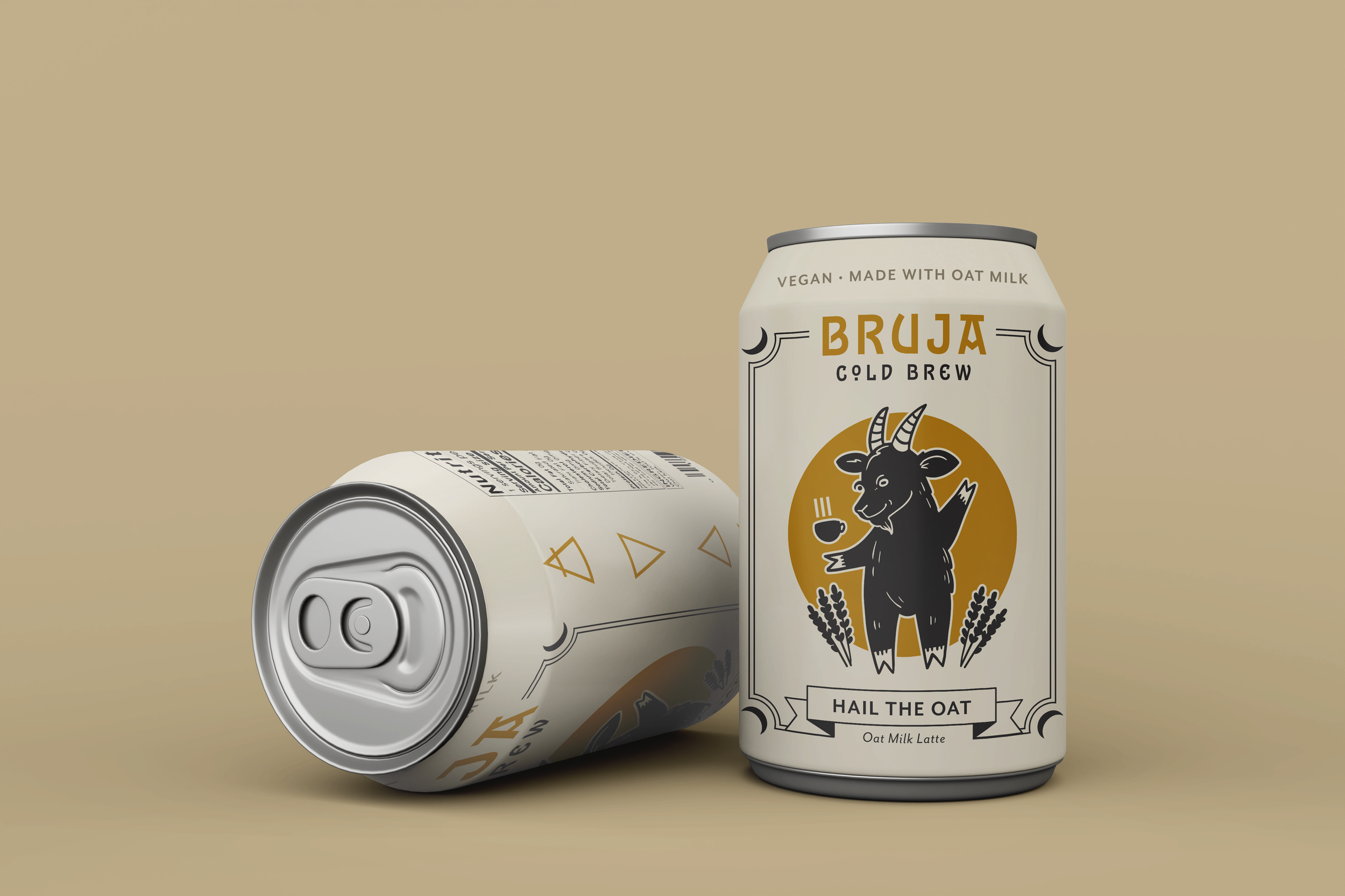
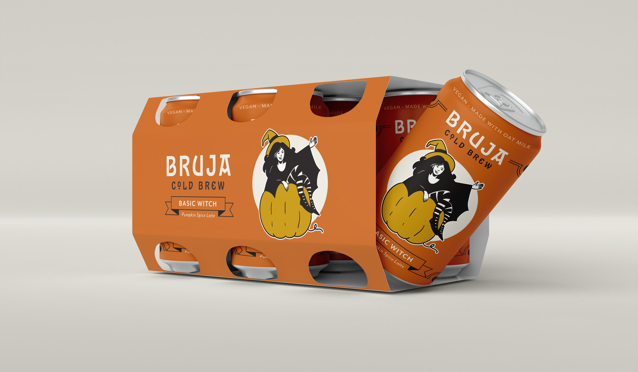
For the second round of drafts, I illustrated additional characters in order to feature three flavors. I also began laying out essential label elements including the barcode and nutritional information.


The next step was to refine this concept, finalizing the logotype, adding additional information about the brand, developing each flavor name, and enhancing the color palette to better differentiate between the flavors.
Final Design


Reflection
Through this process, I learned a lot about designing for cans and gained an overall appreciation for packaging design. I also enjoyed developing the character illustrations which I feel brought life to the brand. Moving forward with this project, I would like to continue to develop the box packaging and create a multi-flavor six pack.