Revolution Roller Rink
Branding
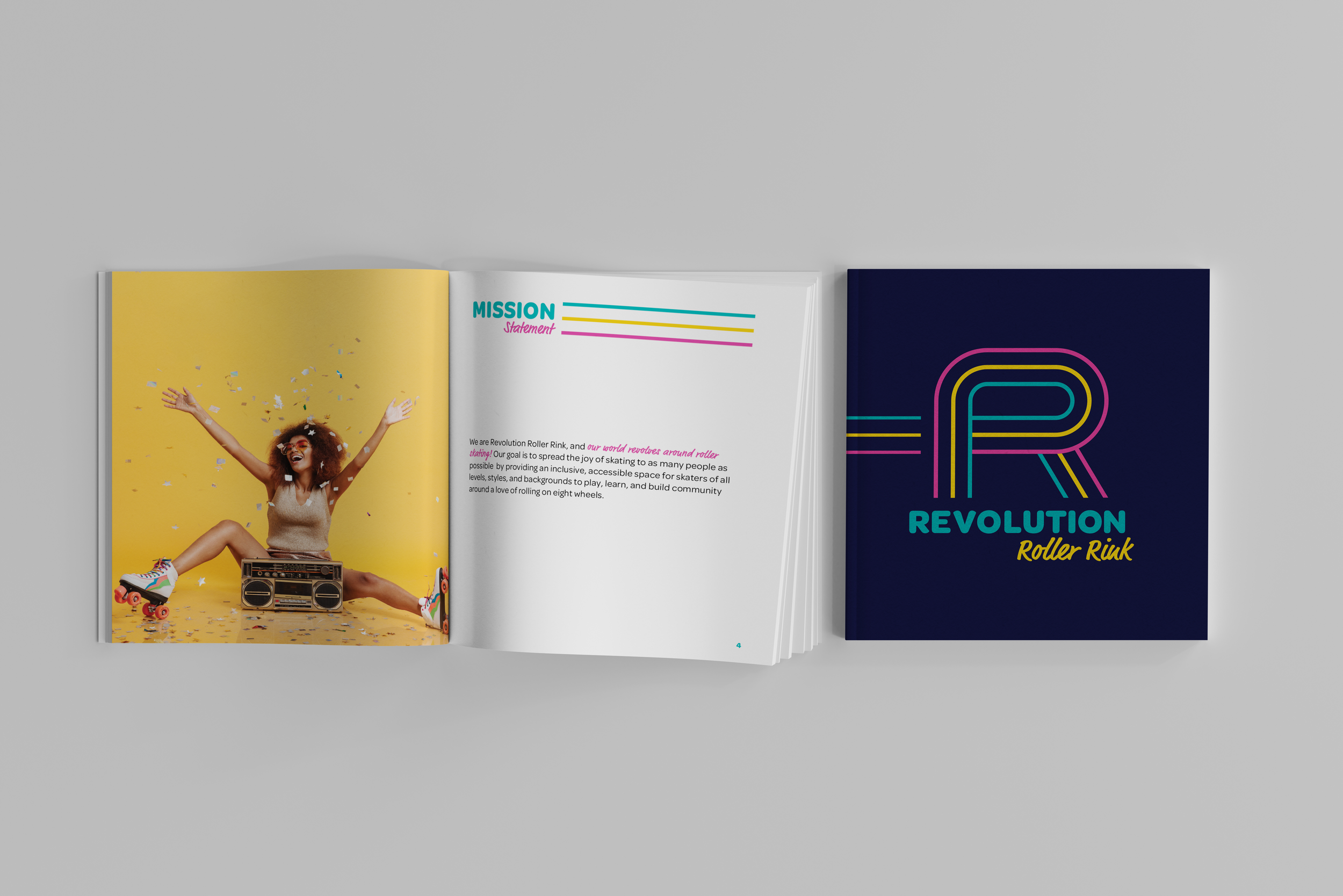
At Revolution Roller Rink, the world revolves around roller skating. Revolution’s goal is to spread the joy of skating to as many people as possible by providing an inclusive, accessible space for skaters of all levels, styles, and backgrounds to play, learn, and build community around a love of rolling on eight wheels.
Challenge: To develop a full branding package for Revolution Roller Rink, and design a booklet detailing the brand guidelines.
Inspiration & Ideation
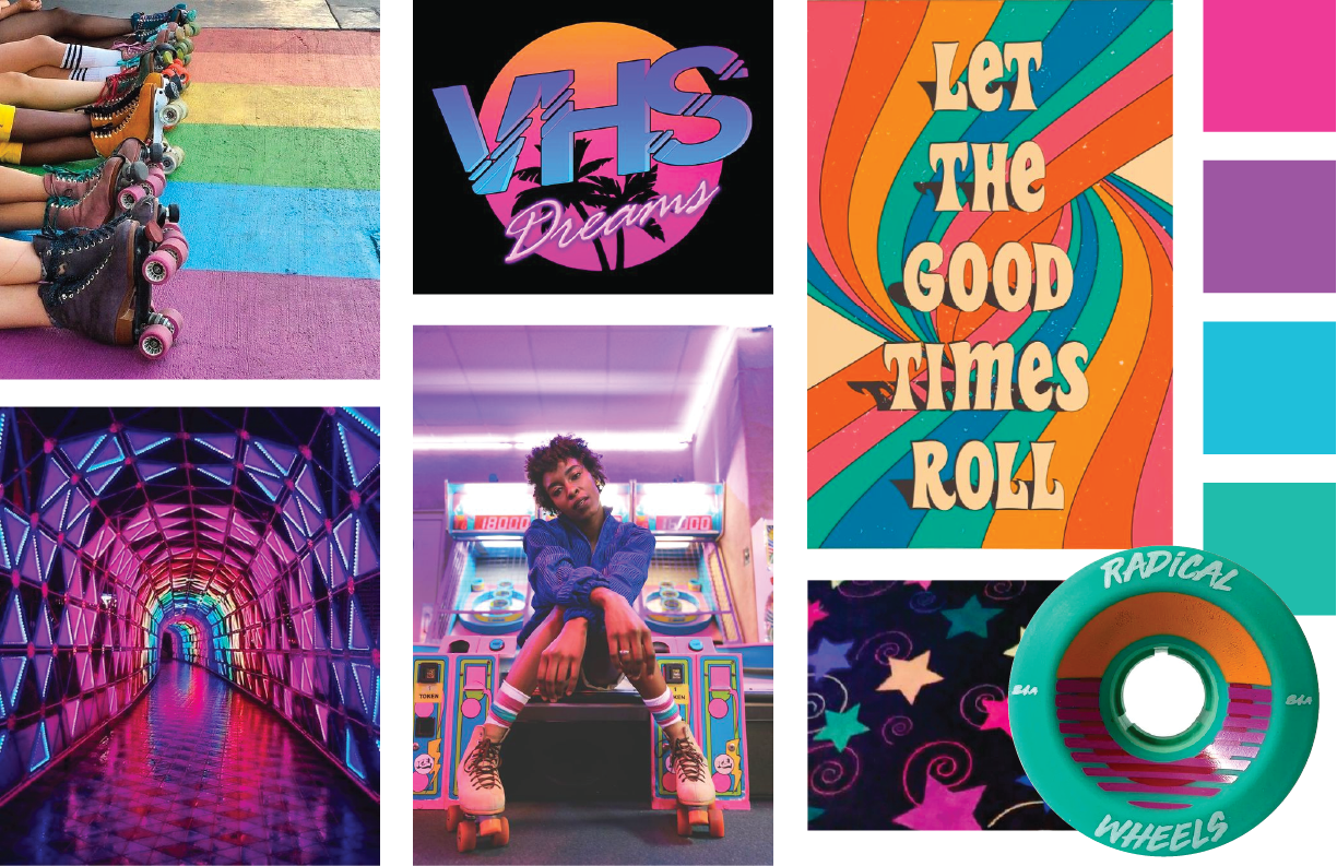
Moodboard & Sketches

Logo Drafts
Round One
Round 2
After a round of feedback, I moved forward with the custom letter R option – with it’s wide counter space representing the elliptical shape of a roller rink – and refined the shape to make the letterform more legible. The finishing touches for the final logo included type and color changes to better suit the fun and friendly personality of the brand.

Final Design
Logo Overview
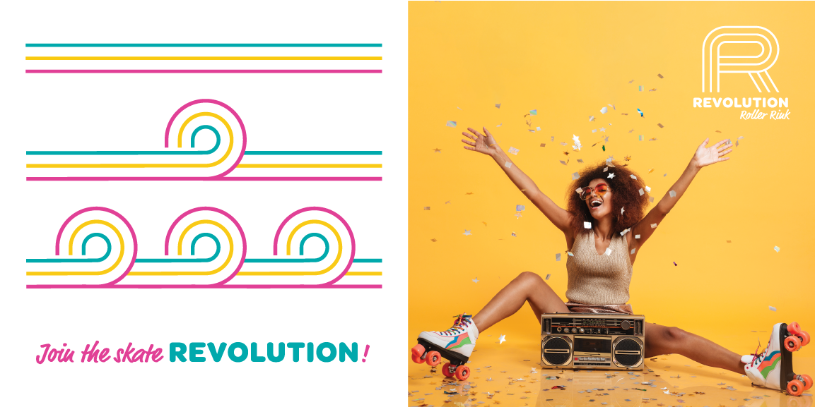
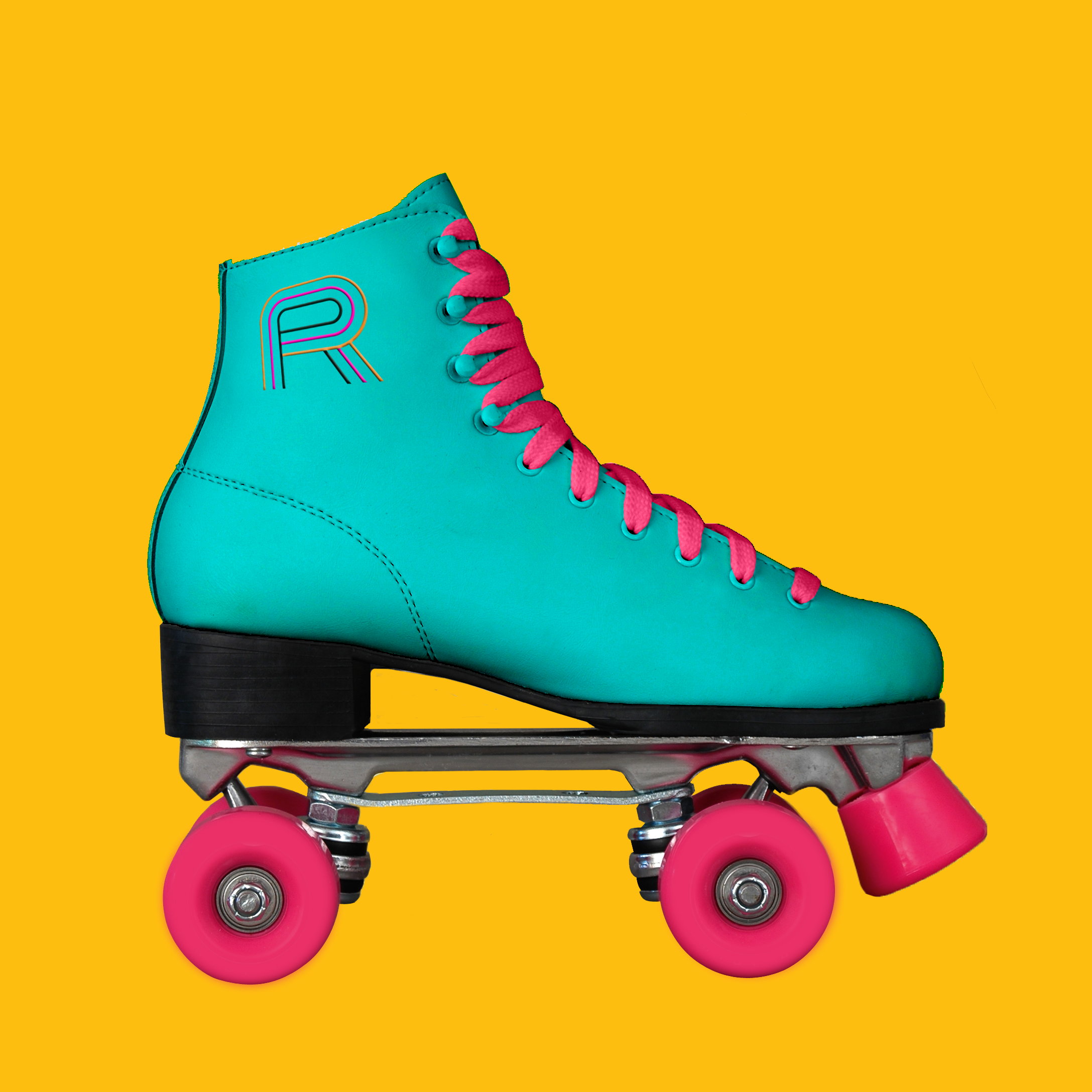
The logo is an essential part of the Revolution Roller Rink brand identity, representing the company’s values, as well as a passion for roller skating. The custom letter logo mark is made up of three lines inspired by movement, community, and the three R's in the name. and it features a wide counter space that mimics the elliptical shape of a traditional roller rink. The logo fonts were selected for their fun and friendly personalities, while the combination of typefaces references the 1970's and 80's when roller skating was a major pop culture phenomenon.
Brand Elements
Logo Variations

Type & Color

Pattern, Tagline & Photography